Danceeafe
Our primary task was to give a modern point of view to the logo, a logo that speaks for the brand and gives an authentic brand identity, which helps to enter both the global and domestic markets.
Strategy
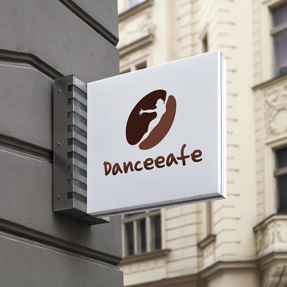
Danceeafe is a brand which is a combination of dance and cafeteria. The primary aim was to create brand awareness; since it’s a combination of dance and cafeteria client wanted the logo to get a touch of both elements. So, the typeface should be different from any other brand in the market. From giving a solid impression to creating a long-lasting memory in one’s head, a brand logo has much to do. The primary issue we focused on at that time was to create a logo that could overpower the competitors. Thus, we designed a logo in two shades inspired by coffee beans, and the primary icons stand for coffee beans and a girl dancing. Thus we managed to create a logo that can serve as the foundation for the entire narrative we had about the brand and its characteristics.
